Every design choice made by a major news or magazine website is deliberate. The choices you make will determine whether people will remain on your site.
News and magazine websites are unlike traditional business websites. News and magazine sites need to present a lot of information in an easily traversable format. Users need to get the information they seek without a headache.
Let’s have a look at 10 essential principles that will help you create a fantastic website.
1. NAVIGATION
Make it easier for your readers to jump through sections by providing a navigation tab on the top. It will not only make your news site look more professional but will also bring positive changes on the bounce rate. For better understanding, let’s have a look at the example of BBC’s navigation bar:

BBC makes use of two separate nav bars. This allows the reader to immediately decide which topic they’re interested in. This granular approach allows the user to specifically decide what they would like to read.
2. LEFT ALIGNED TEXT
Centre aligned text is a dated style technique that is not recommended. It may seem like a simple decision, but left aligned text reflects the style of newspapers and magazines. The association of that style to newspapers and magazines allows the reader to inherently feel more comfortable with information that they are reading. In addition to this, it increases the aesthetic value of a website’s design.
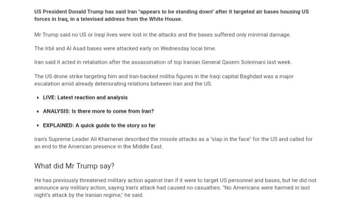
3. VISUAL HIERARCHY
Visual hierarchy is the psychological way of getting people’s attention to the most important things by focusing on how they perceive something. Like the F and Z patterns, news sites ought to have a visual hierarchy for Increased readability.
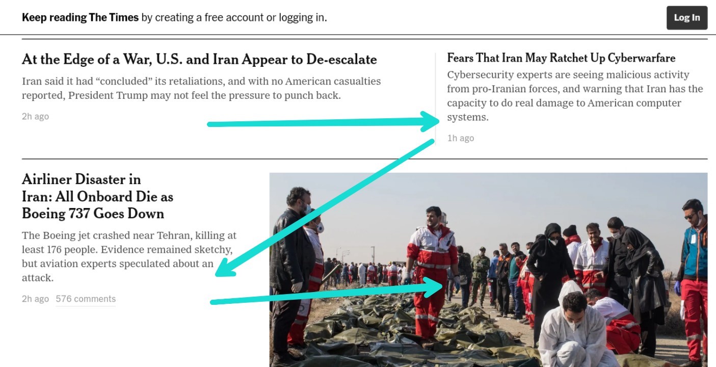
You can see how the New York Times using Z-pattern to bring visual hierarchy. You can do this by placing your content systematically and aligning your texts to the left.
4. FEATURED ARTICLE ON TOP
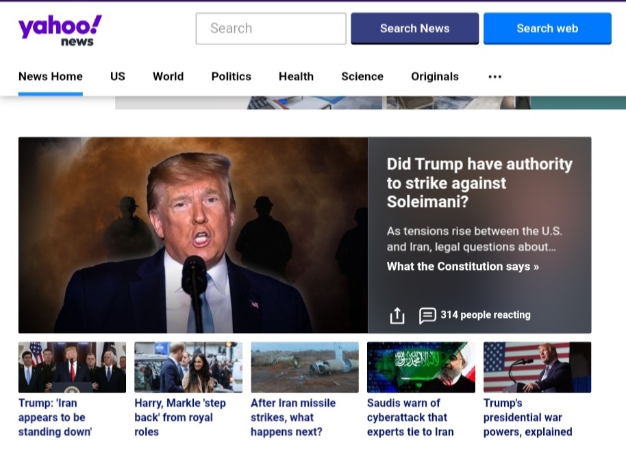
You should put the best news or article of the day or the week on the top of the homepage to get more attention. Use a big picture with large fonts so that that’s the first thing people see. For example, Yahoo News’ homepage:
5. EASY TRANSITION FEATURES
After a reader has finished with your article, what do you want them to do next? Typically, the goal is to keep the user on the site for as long as possible. This is where transition features come into play.
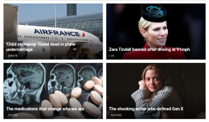
They can be different. A transition feature can be created just by a single next button which takes the reader to the next story or it can also be some related articles at the bottom where user can easily click and read.
6. BIGGER PICTURES THAT DESCRIBE THE NEWS
Pictures always attract visitors, no matter what kind of site it is. Use images relevant to the article or story they are attached to. Large, high resolution photos should be the focus. They should grab the readers’ attention. The image paired with the headline should give the reader some preliminary information before reading the article.
7. STORY COLLAGE
Your most important stories should feature a large image and fonts. But what about the less important ones? They also took time to write and should be read.
How can you make them visible enough around big pictures? A story collage is the answer. See below for an example.
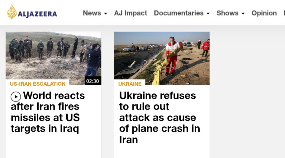
A collage helps stories and articles stand out in the crowd.
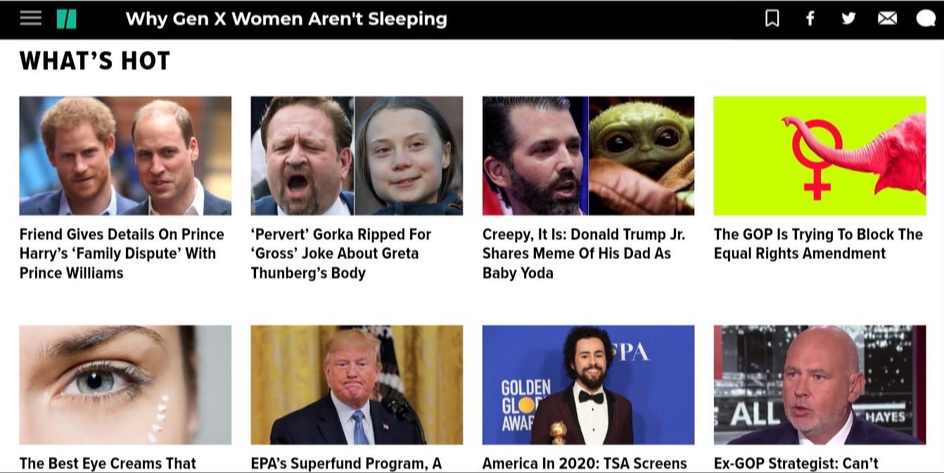
8. DISCIPLINED EDITING
Don’t get too crazy with your editing and designing. Keeping it simple and professional is essential for the credibility of a news site. Disciplined design and editing allows readers to get more familiar with how you are presenting content.
9.EASY READABILITY
Readability becomes one of the critical factors on which many things will rely on. If your contents have easy readability, the same people will return to your site more often, thus increasing your sites credibility and popularity.
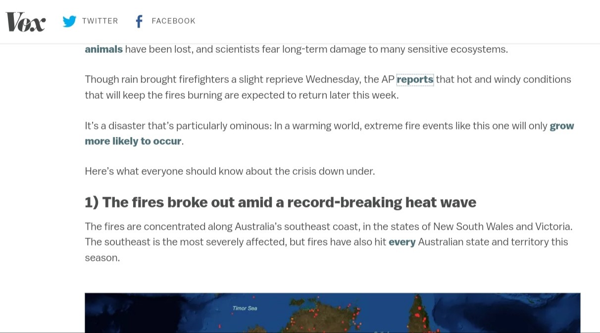
Splitting content into small paragraphs and subheadings brings easy readability which can be utilized for not only a better design but also reader satisfaction.
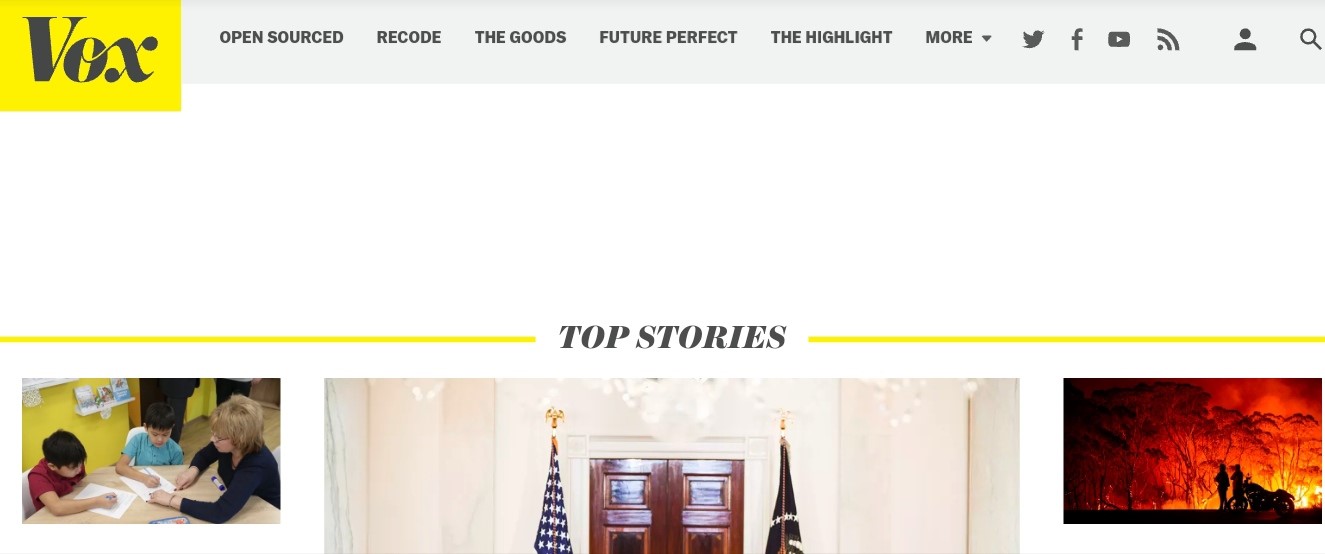
10. FEWER COLOR VARIATIONS
A consistent colour theme allows readers to associate your brand with information. Less colour variation makes a page look more professional. Vox’s homepage is a great example of this.
The Preferred WordPress Theme for News & Magazines
If you are trying to find a WordPress theme for your news or magazine site, you can use the GTL News. It brings you control over your content, ensures visual hierarchy and a minimalistic look which is perfect for news websites.